Colour theory transcends its utility as merely a tool for artists and designers; it is a pivotal element in our interaction with and perception of the world. Whether it comes to website design, home decoration, or fashion choices, a solid grasp of colour theory principles can elevate our decision-making, making our choices more deliberate and impactful. At the heart of colour theory is the exploration of how colours mix, match, and influence one another, serving as a guide to understanding their visual effects, relationships, and the emotional responses they evoke. Central to colour theory is the colour wheel, which visually organises primary, secondary, and tertiary colours into a cohesive circular format. This arrangement not only helps identify colour relationships—such as complementary, analogous, and triadic combinations—but also lays the groundwork for creating balanced and harmonious designs.
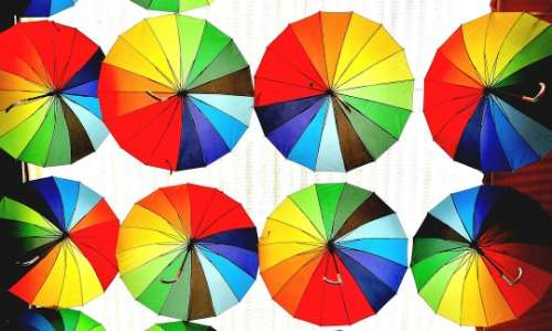
The colour wheel starts with primary colours—red, blue, and yellow—the irreplaceable hues that form the basis of all other colours. By mixing these, we get the secondary colours: green, orange, and purple. Further mixing of a primary colour with a neighbouring secondary colour yields the tertiary colours, examples of which include red-orange, yellow-green, and blue-purple. Understanding how these colours relate to each other is crucial for crafting visually appealing designs. Complementary colours, sitting opposite each other on the wheel, offer a vibrant contrast, while analogous colours provide a serene harmony, ideal for designs aiming for subtlety and calm. Triadic colour schemes, involving three evenly spaced colours on the wheel, introduce a balanced vibrancy. Meanwhile, monochromatic colour schemes, which play with different shades, tints, and tones of a single colour, exude sophistication and unity, perfect for minimalist aesthetics.
The psychological dimension of colour is profound, influencing our emotions and behaviours in nuanced ways. Red, with its bold energy, can signal passion and urgency, capturing attention and prompting action—a reason for its prevalence in sale signs and call-to-action buttons. Blue’s calm and trustworthiness make it a favourite in corporate branding and serene interior designs. Yellow, bright and cheerful, radiates optimism, though its intensity calls for moderated use. Green, echoing nature, promotes feelings of growth, health, and balance, making it a staple in designs centred around wellness and sustainability. Purple’s association with luxury and creativity lends it to brands that want to project opulence or artistic flair, while black and white, representing sophistication and simplicity respectively, are versatile choices that can either anchor or lighten design elements.
Applying colour theory in practical scenarios, such as graphic and interior design, empowers designers to craft compelling visual narratives. The strategic use of colour can significantly influence brand perception—for instance, green might be chosen by an eco-conscious brand to highlight its commitment to sustainability, while blue could help a tech company appear more reliable and innovative. In the realm of interior design, colour choice dictates the ambiance of a space, with cool colours fostering tranquility and warm hues creating an inviting atmosphere. Understanding the psychological effects of colours enables designers to manipulate mood and convey specific messages, making colour theory a critical component in the toolbox of any creative professional.